

The new Overview
Choose the right card for your dashboard
Beginner
Home Assistant 2026.6+
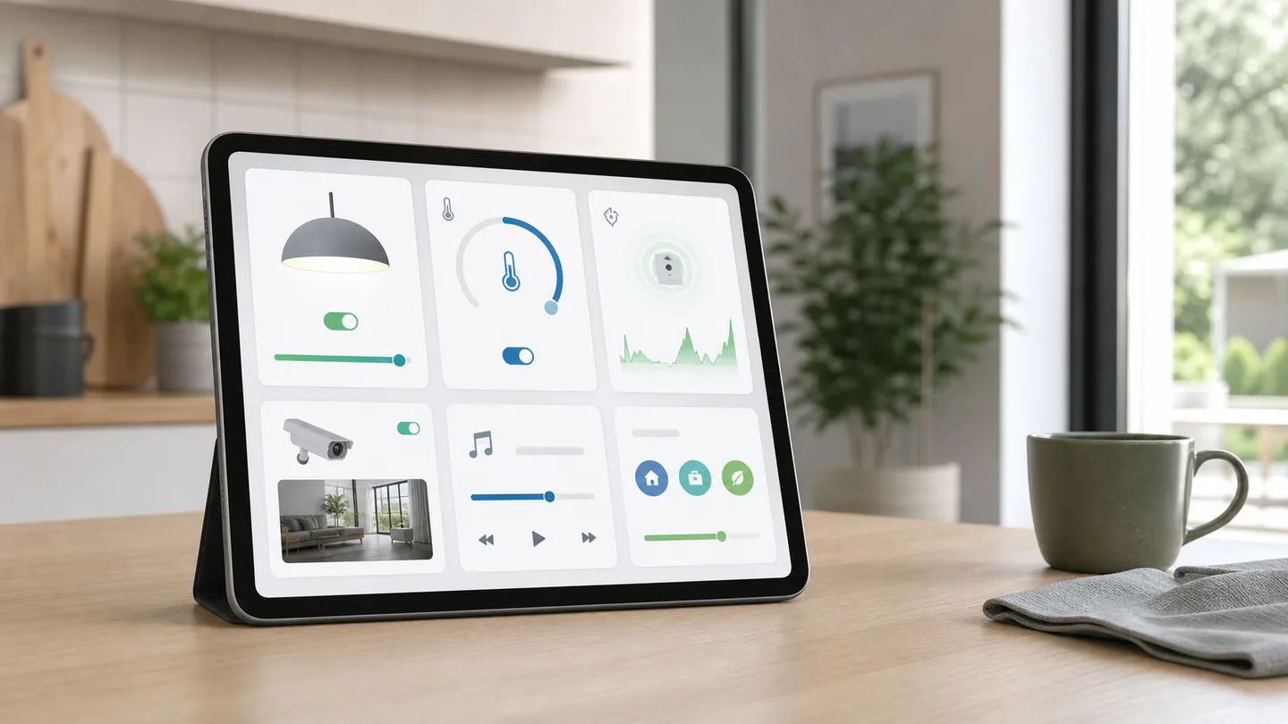
A good dashboard does not start with “Which card looks the smartest?” It starts with “What should I be able to see or do here?”
Home Assistant 2026.6 changed the card picker so that you can choose a device or entity first. Home Assistant then suggests suitable cards with previews based on your own data. It is a small change that makes dashboard building much easier without knowing every card name.
Start with the task
Section titled “Start with the task”Choose a card based on the primary action:
| I want to… | Good first choice |
|---|---|
| turn on, dim, or change a light | Tile with relevant features |
| see temperature and its recent trend | Tile or sensor card with a graph |
| control heating | Tile with temperature and mode controls |
| show several devices in one room | Area card or a section of tiles |
| show energy data over time | Statistics graph or Energy card |
| view a camera | Picture entity or a dedicated camera card |
| run a scene or script | Shortcut or button |
The tile card is a good starting point for most ordinary entities. Add only the features you use. A lamp rarely needs brightness, color temperature, a color picker, and six favorites on the home’s front page.
Add a card by entity
Section titled “Add a card by entity”-
Open the dashboard
Go to Settings → Dashboards, select the dashboard, and open the view you want to change.
-
Start editing
Select the edit button. In a Sections view, add the card in the relevant section.
-
Choose by entity
Select By entity and find something such as
Living room floor lamp. If it is missing, it may appear under entities with no assigned area. -
Compare the previews
Review the suggested cards using the lamp’s current data. Choose the simplest card that solves the task.
-
Add a few features
A tile might gain brightness or color temperature controls. Keep hold assigned to more info unless you have a clear reason to change it.
-
Adjust the size
In a Sections view, drag the card to a suitable width. Enable precise mode if the normal grid is too coarse.
-
Save and test on a phone
Select Done and try the dashboard at the size your household actually uses. A card that looks good on a large display may consume too much space on a phone.
Tile, area, or graph?
Section titled “Tile, area, or graph?”Tile for everyday control
Section titled “Tile for everyday control”Use a tile for one thing you regularly need to see or change. It can show the state and offer relevant quick controls without opening a dialog.
Area for a quick room overview
Section titled “Area for a quick room overview”An area card works well as an entry point to the kitchen, living room, or garden. It is less suitable when you need to control three particular lights independently from the front page.
Graph for a question over time
Section titled “Graph for a question over time”Use a graph when change over time matters more than the current value: temperature, humidity, power, or air quality. A graph of a door contact is usually less useful than its Activity.
Shortcut for a deliberate action
Section titled “Shortcut for a deliberate action”The shortcut card suits a script, scene, or destination. Give it a specific
name such as Good night or Open energy use so everyone knows what it does.
Build a calm front page
Section titled “Build a calm front page”A simple front page can contain:
- a small section with the home’s essential status;
- quick access to lighting, heating, and security status;
- area cards leading to room views;
- only alerts that require action.
Move detail, long graphs, and rarely used settings to separate views. A dashboard does not become more useful by listing every entity on one long page.
Safer tap actions
Section titled “Safer tap actions”A single tap can reasonably toggle a light. A single tap on a lock, gate, alarm, or water valve deserves more thought.
For safety-critical devices:
- open more info on tap instead of acting immediately;
- avoid large controls that are easy to hit accidentally;
- show the current status clearly;
- test phone, wall display, and dark mode;
- do not treat a dashboard card as proof that a physical lock or gate reached its final state.
When the suggestions do not fit
Section titled “When the suggestions do not fit”The picker offers a starting point, not a definitive answer. Choose By card when you know you need a particular type.
Then ask:
- Should the card show one value or a trend?
- Should it control something or only provide information?
- Should every user be able to see it?
- Are its features supported by the entity?
- Could the same task use less space?
Visibility conditions can hide a card from particular users or show it only in a relevant state. Use them sparingly: a card that suddenly disappears can be confusing too.
Common problems
Section titled “Common problems”The entity is missing from the picker
Section titled “The entity is missing from the picker”Check Unassigned and give the device the correct area. Also confirm that the entity is enabled.
A feature cannot be selected
Section titled “A feature cannot be selected”Card features depend on the entity domain and supported capabilities. A light without color support cannot gain a useful color control.
The card is too tall or narrow
Section titled “The card is too tall or narrow”Open the card’s Layout tab. Adjust its size or move it to a section with more space.
The dashboard has become slow
Section titled “The dashboard has become slow”Remove duplicates, limit simultaneous live cameras and large graphs, and test without the most recently added custom card.
Dashboard design
Plan multiple views with the dashboard design guide.
Official sources
Section titled “Official sources”Comments
SmartBolig // AI Core
SmartBolig AI
Get help with troubleshooting, architecture and concrete configuration. I use broad AI knowledge and find SmartBolig guides when they improve the answer.
Home AssistantAutomationsESPHomeFirmwareZigbee · MatterDevicesHomelabInfrastructure
Start with a useful question
WORK MODE